 6 October 2026
Common website mistakes that drive customers away
The web design mistakes that cost a small business the most customers, how to spot them in ten minutes on your phone and how to fix each one.
How to tell a badly made website
A badly made website isn’t an ugly one: it’s one that makes the customer leave without calling, booking or asking for a price. Plenty of beautiful websites fail at that and plenty of simple ones get it right. The web design mistakes that cost the most customers are hardly ever about colours or fonts; they’re about missing information, unnecessary steps and things that don’t work on a phone.
The way to spot them is to put yourself in the customer’s shoes. Open your website on your phone, on mobile data rather than your home wifi, and try to do what they would: find out whether you do what they need, what it costs and how to hire you. Time yourself. Whatever is hard for you, who knows the business, is harder for them.
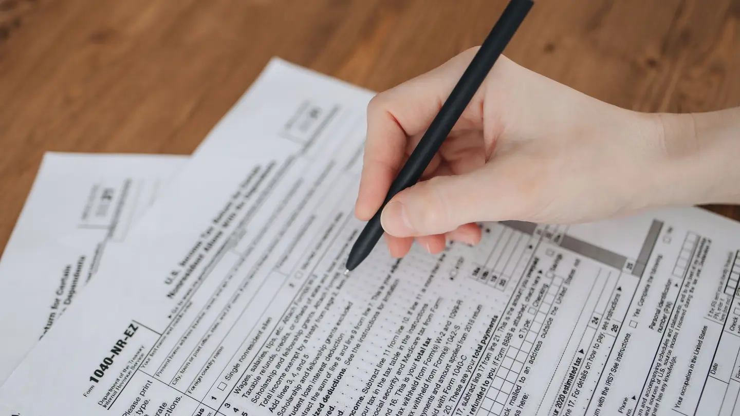
Information mistakes: what the customer looks for and can’t find
Many badly designed websites fail before design even comes into it: they lack what the customer needs to know to decide. These are the easiest mistakes to fix, because nothing needs redesigning; you just have to write what’s missing where people look for it:
- No price. Not the price, not a starting price, not what makes it vary. Anyone who can’t see it assumes it’s expensive or that they’ll have to haggle, and asks the business next door.
- No visible phone number. The number hidden in the footer or only on the “Contact” page, and not tappable to call from a phone.
- No way of knowing where you work: no address, no area you cover, no mention of whether you do home visits.
- Opening hours that aren’t the real ones, or none at all.
- A first screen that doesn’t say what you do: “Comprehensive tailored solutions” could be an accountancy firm or a renovation company.
- Not a single photo of your own: only stock images the customer has already seen on ten other websites.
 Keep readingHow to get locksmith customers without paying for every lead
Web design mistakes on mobile: slow, tiny and things in the way
Nearly everyone looking for a local business does it on their phone, and often in a hurry. A website that looks fine on a computer can be impossible to use on a small screen. These are the most common failings:
- It takes ages to load because the photos are as heavy as when they came off the camera.
- Tiny text, buttons crammed together and links you can’t tap with a finger.
- Pop-ups the moment you arrive —the newsletter, the chat, the offer— covering what you came to see.
- Text or tables that run off the screen and force you to scroll sideways.
- Videos that play on their own, with sound.
- A menu with fifteen options that takes up the whole screen.
Endless forms and other unnecessary steps
Every extra field on a form means people giving up halfway. A form that asks for first name, surname, ID number, full address, how you heard about us and a message of at least a hundred characters just to ask for a price is asking not to be filled in. Ask for what you need to reply properly —what, where, by when and how to get in touch— and nothing more. There are examples of what to ask by trade in contact form.
The same goes for steps: booking shouldn’t force anyone to create an account, and asking for a quote shouldn’t lead to a page that leads to another one. Nor does it help if the form is the only way in: some people prefer to call or message on WhatsApp, and some prefer not to talk to anyone. What works is offering both, in plain sight.
And one mistake you can’t see from the outside: the form that works, but whose notification reaches nobody, or lands in an inbox nobody checks. Send yourself a test request every so often and check it arrives.

Untouched template text
Templates save a lot of work, and they aren’t the problem. The problem is publishing them as they come: the placeholder text left in a section, the “we are a leading company with years of experience” that anyone could sign, the photo of a team that isn’t yours, the sample service you don’t offer or the made-up phone number at the bottom of an inner page.
Customers notice, and so does Google: lots of websites with the same text have nothing of their own to show. The review takes an hour: read every page in full, including the ones you think nobody visits, and ask yourself of every sentence whether it could be on your competitor’s website. If it could, replace it with something only you can say: how many years you’ve been at it, where you work, how you do it, what the price includes. The list of what should be there, in what a business website should include.
Web design tips that actually matter
Once the information is in place and mobile is sorted, design does its part. You don’t need to know about design to get the basics right:
- One main button per screen, saying what it does: “Book an appointment” or “Request a quote”, not “Submit”.
- Large text with good contrast: light grey on white can’t be read in the sun.
- Few colours, with the most eye-catching one kept for the main button.
- Your own photos, of your premises, your team and finished jobs, even if they aren’t perfect.
- Reviews from real customers, with their names, and never made up.
- The same menu on every page, and addresses that make sense: /services, /prices, /contact.
- The legal notice and privacy policy in the footer, as the law requires.
 Keep readingHow much does a website cost for a freelancer in Spain?
Check your website in ten minutes
If you want to know today whether your website has any of these mistakes, do this on your phone and note down whatever fails:
- Search Google for your trade and your town and see whether you appear; then search for your business name.
- Open your website and count the seconds until something useful appears.
- Without scrolling, check whether it’s clear what you do and where.
- Look for the price of your most requested service and see how long it takes you to find it.
- Tap the phone number and check it calls.
- Fill in the form or make a test booking, and see whether the notification reaches you.
- Read the home page out loud and point out every sentence that could belong to anyone.
Fix it or start again
If one or two points fail, fix them: it’s an afternoon’s work. If almost all of them fail, or you can’t change a price without calling whoever built it, starting again usually pays off more than patching it up. Compare calmly: a custom website makes sense if you need something that doesn’t exist; for everything else, a template made for your trade that you can edit yourself is usually enough.
Agendra websites come with the basics on this list already in place: services with their prices, your phone and WhatsApp one tap away on mobile, bookings or a short form with the questions you choose, and a notification on your phone for each enquiry. What it can’t do for you is the writing: the website comes with texts for your trade already written, and to make it yours you have to replace them with your own. See how they look in website examples.
Frequently asked questions
What are the most common mistakes on a small business website?
Not showing prices, hiding the phone number, loading slowly or looking wrong on mobile, forms with too many questions, not saying where you work and leaving template text or photos unchanged.
How do I know if my website is badly made?
Open it on your phone, on mobile data, and try to do what a customer would: understand what you do and where, find the price, call and send the form. If anything is hard for you, who knows the business, it’s harder for the customer.
Is it better to fix my website or build a new one?
If one or two points fail, fix them. If almost everything fails or you can’t change a price without depending on whoever built it, it usually pays to start again with something you can edit yourself.
Related pages
More articles

Custom website or template: which to choose if you are self-employed
Not every custom website is justified and not every template is limited. What really sets them apart.
Read the article →
Google Business Profile or a website: why you need both
What the listing does, what it cannot do, and why having only one of them loses you customers.
Read the article →
What a small business website should have
The structure, the parts that can’t be missing, the design elements that help people decide and what a small business website can do without.
Read the article →Your website, live in minutes
Free until your first customer or 6 months · No card · No commitment · Live in minutes