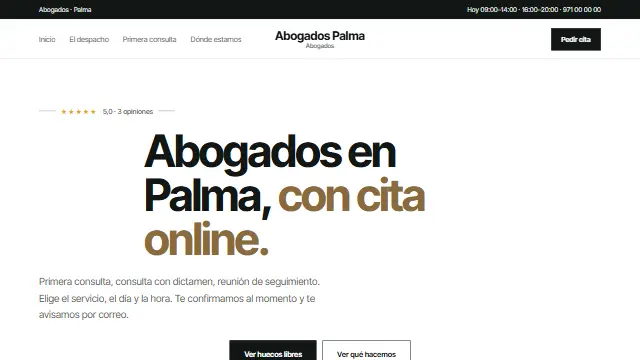
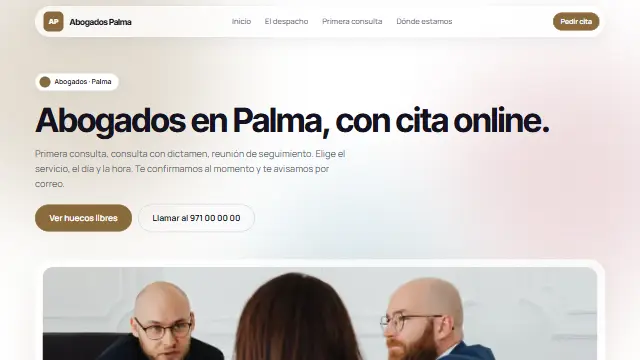
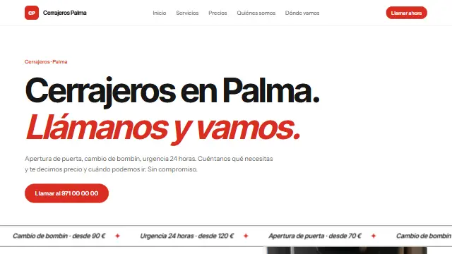
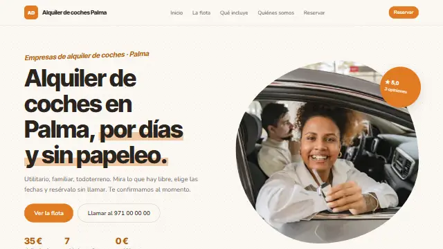
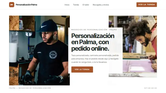
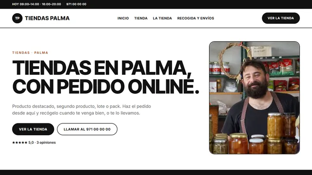
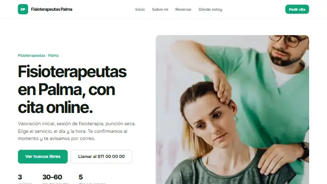
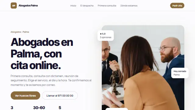
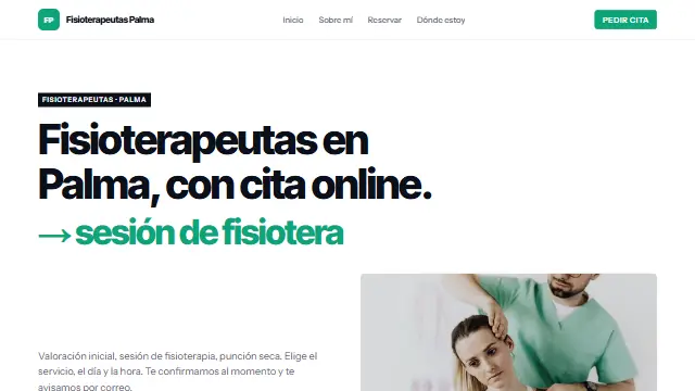
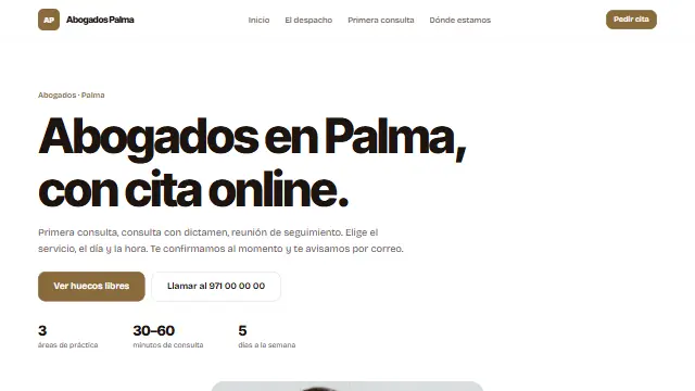
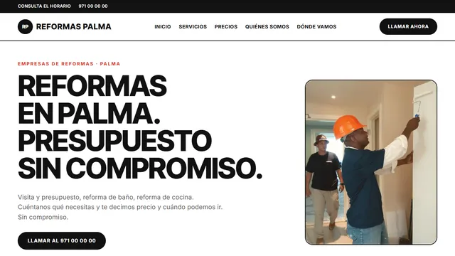
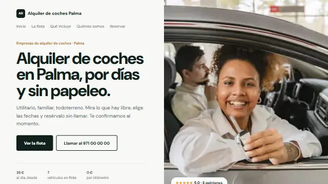
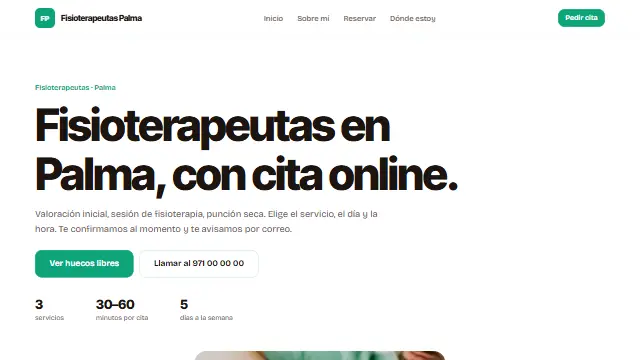
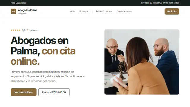
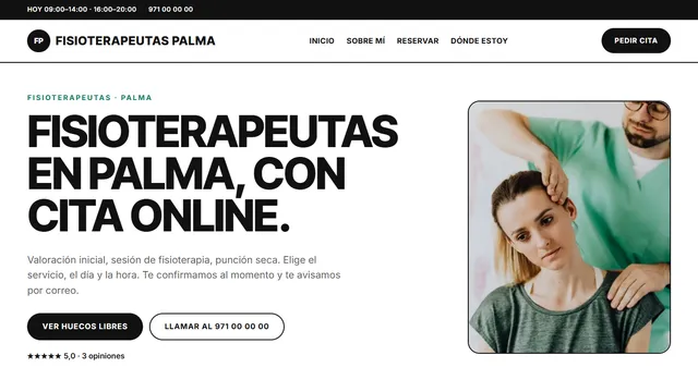
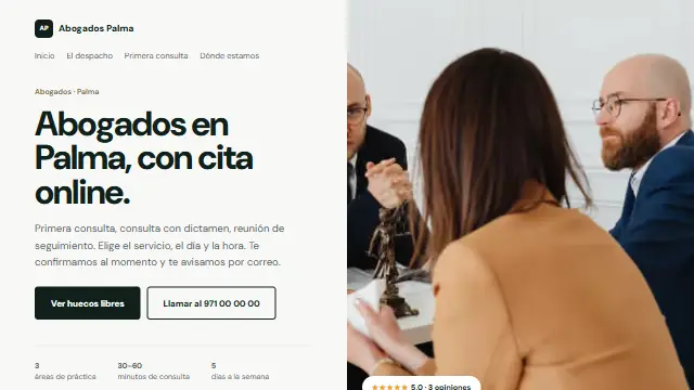
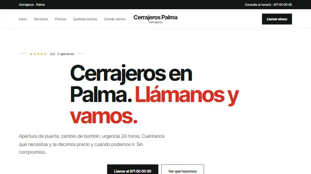
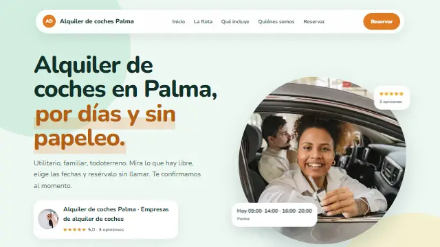
- Clara
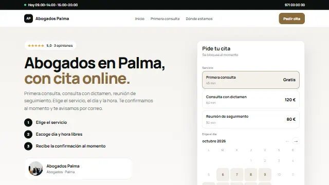
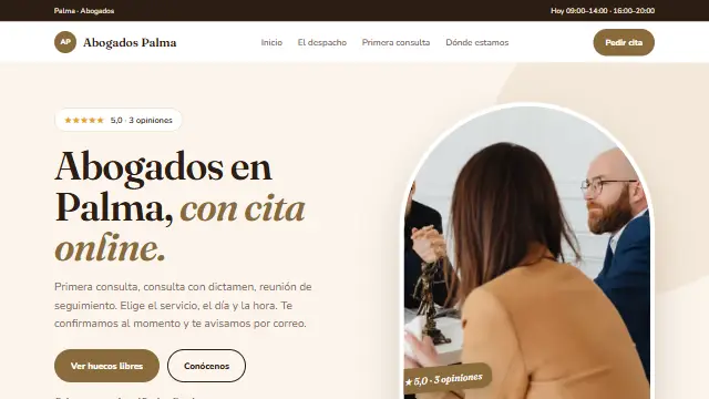
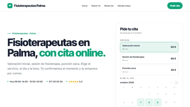
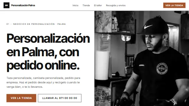
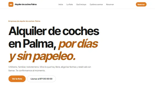
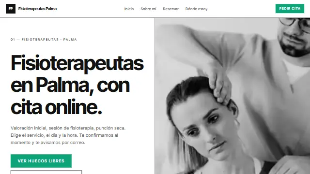
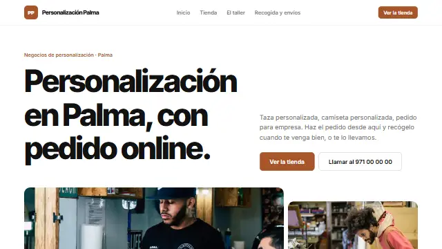
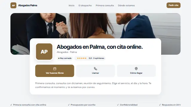
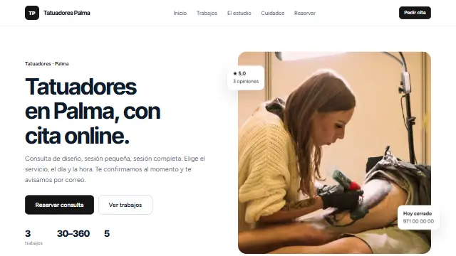
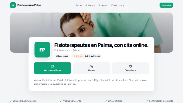
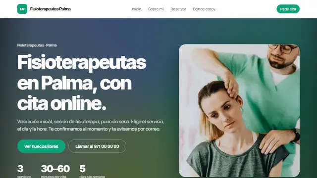
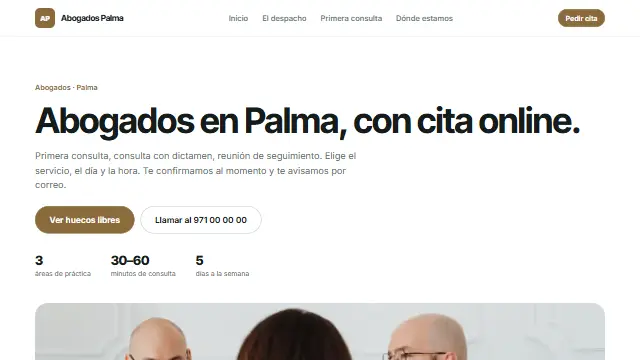
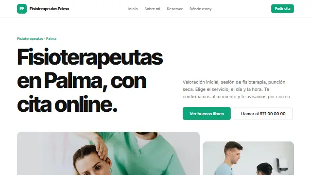
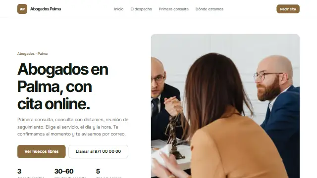
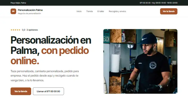
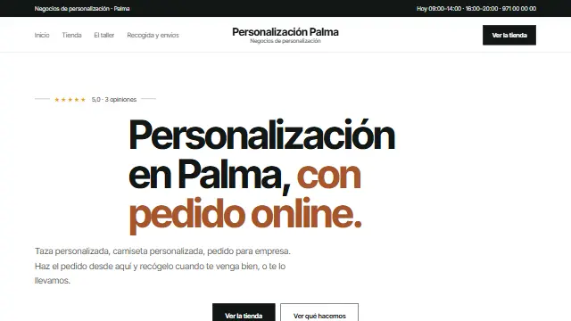
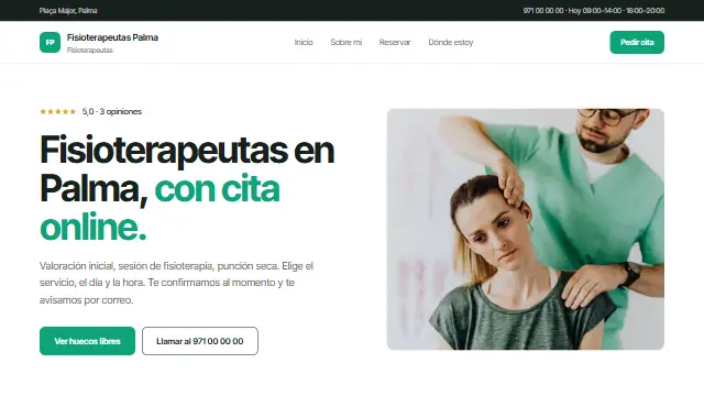
- White background, plenty of space and colour only on the buttons. The one that never gets it wrong. Works well for: Any trade. It is the starting design: practices, clinics, firms and workshops that want a clean website.
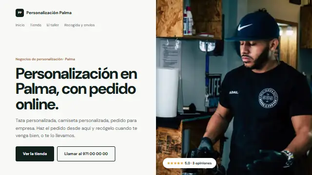
- Partida
- Magazine style: the homepage split in two, text on one side and a full-bleed photo on the other; services in ruled columns and booking in a dark band. Works well for: Businesses with good photos of their work: hair salons, design studios, photographers, interior design.
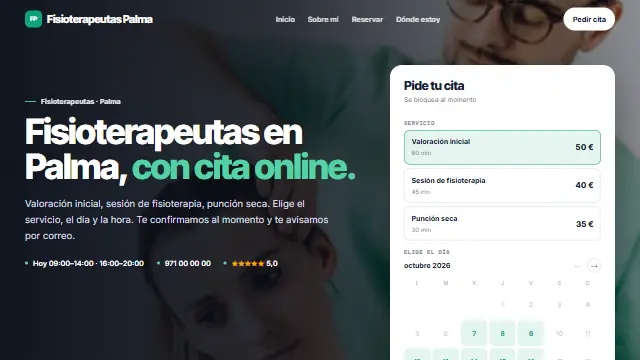
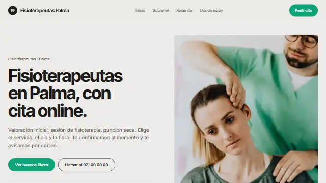
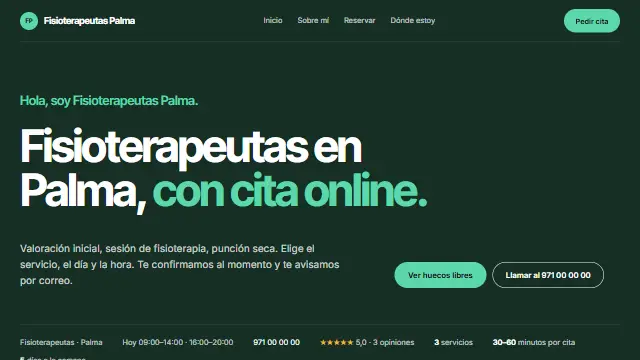
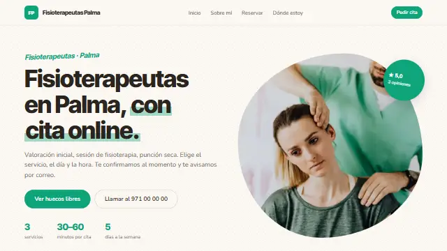
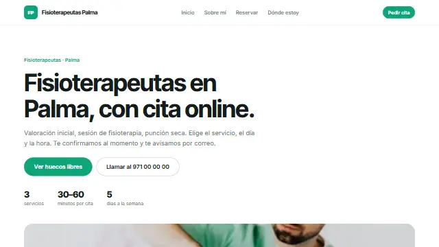
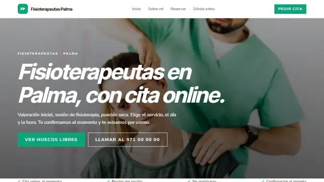
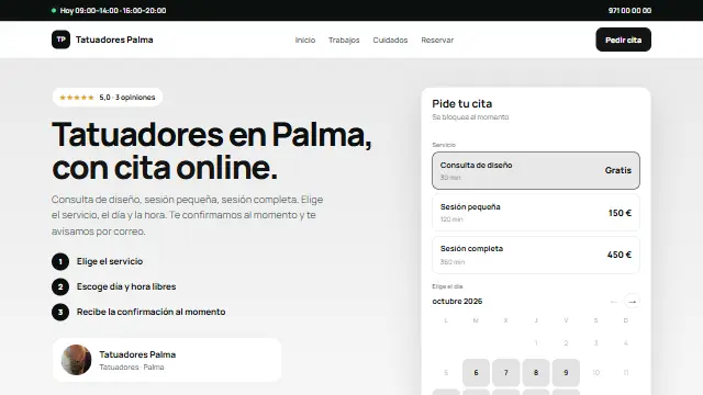
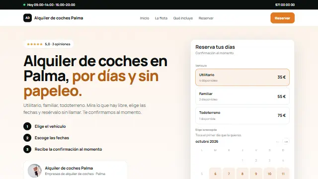
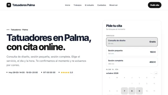
- Directa
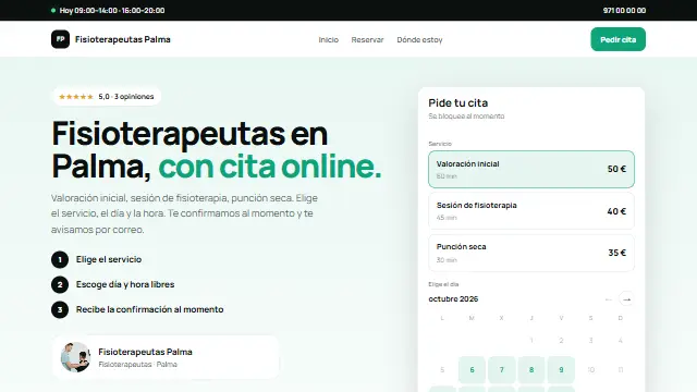
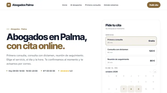
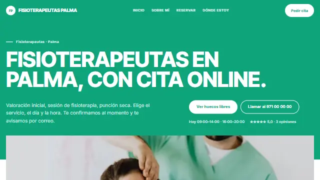
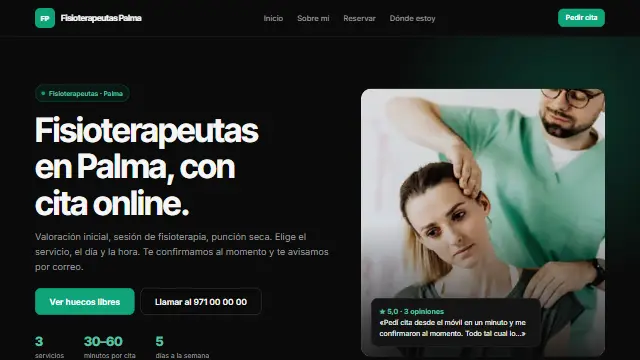
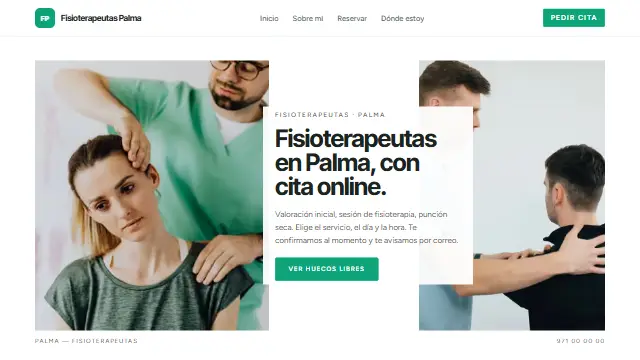
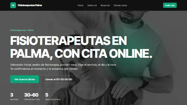
- The calendar right at the top, next to the headline and the three steps to book; services in a table with their price and button. So people book now. Works well for: Those who live from being booked now: physiotherapy, barbers, beauty salons, classes.
- Escaparate
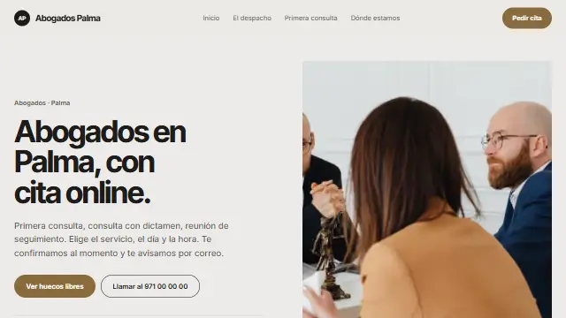
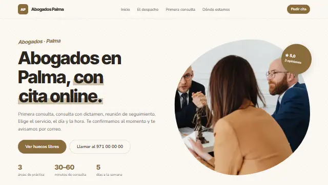
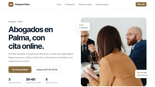
- Editorial: large serif, a centred headline, three arched photos and services in rows with a black rule. Elegant and airy. Works well for: Image-conscious businesses: advanced aesthetics, architects, lawyers, design shops.
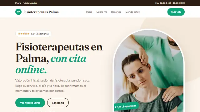
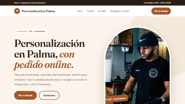
- Cálida
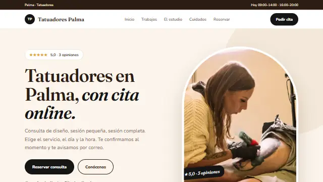
- Cream and serif, the story before the services, arched photos and a real review in a coloured band. Welcoming. Works well for: Practices with a personal touch: psychology, nutrition, therapies, yoga and pilates.
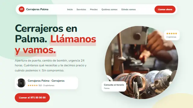
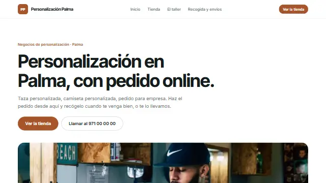
- Cercana
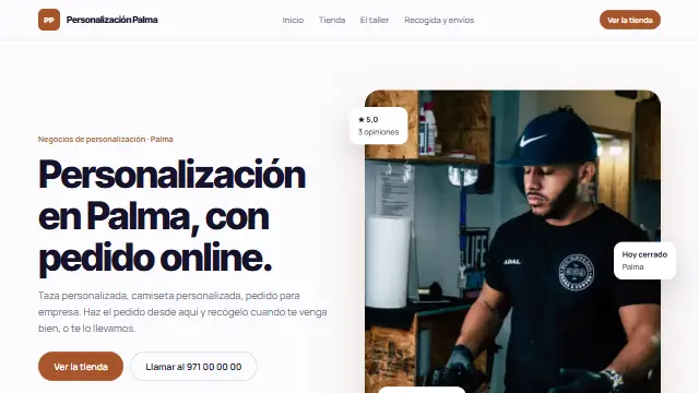
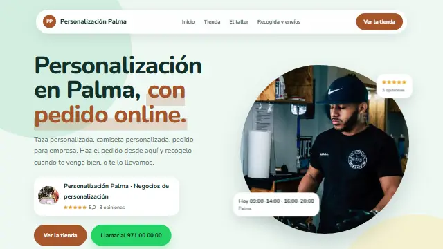
- Rounded shapes, a floating header, “how it works” in three cards and WhatsApp always to hand. Friendly and direct. Works well for: Neighbourhood, first-name-terms businesses: academies, personal trainers, hair salons, workshops.
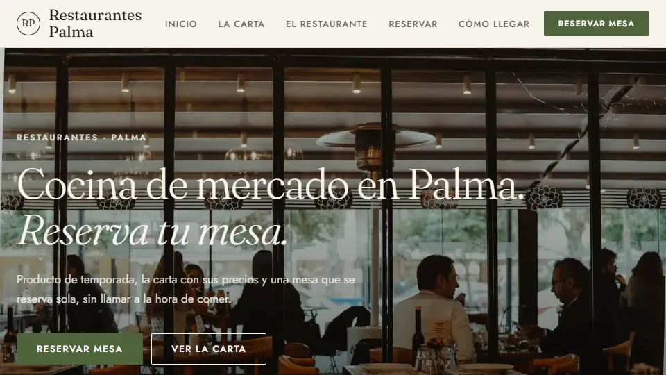
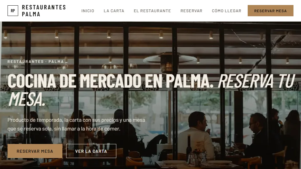
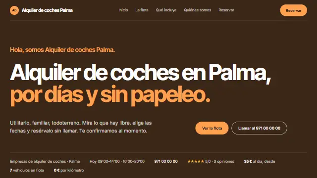
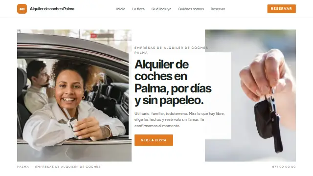
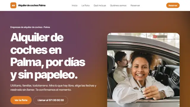
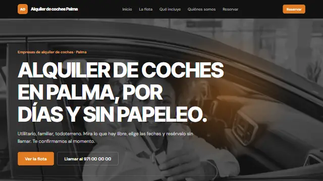
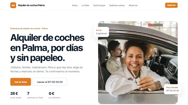
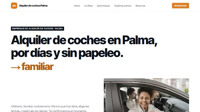
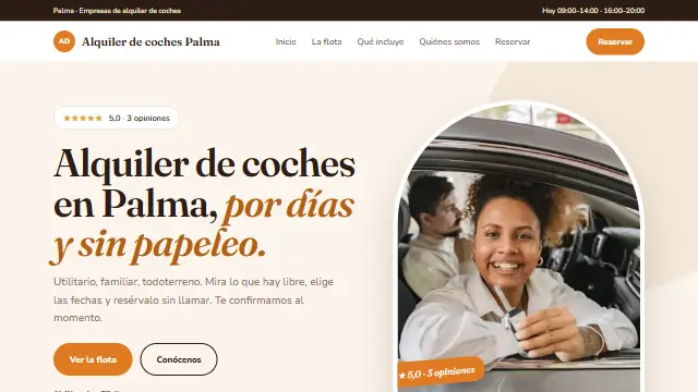
- Panorama
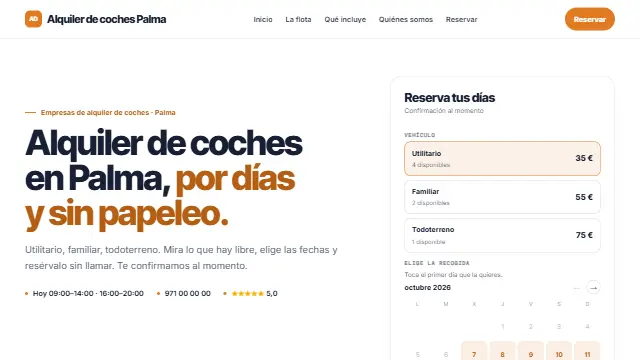
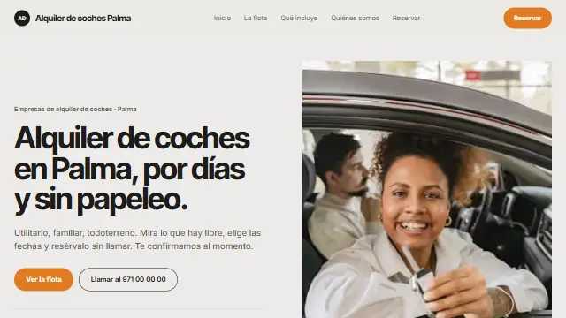
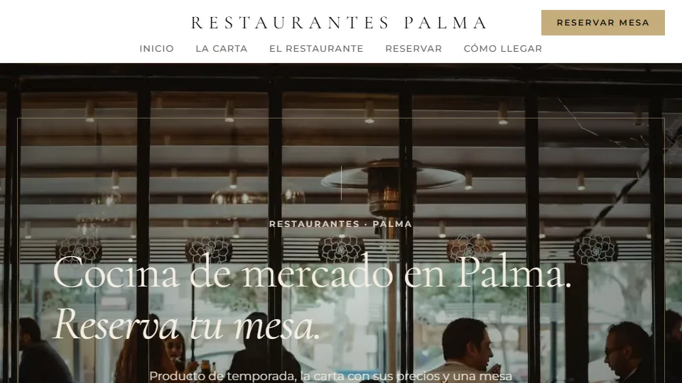
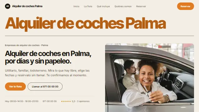
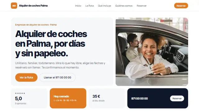
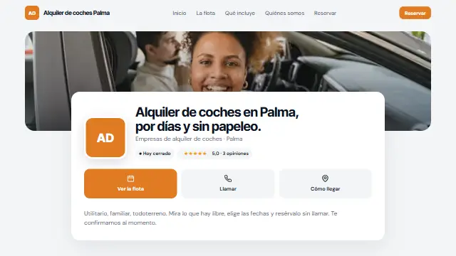
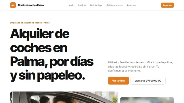
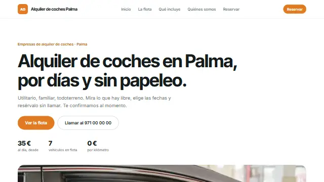
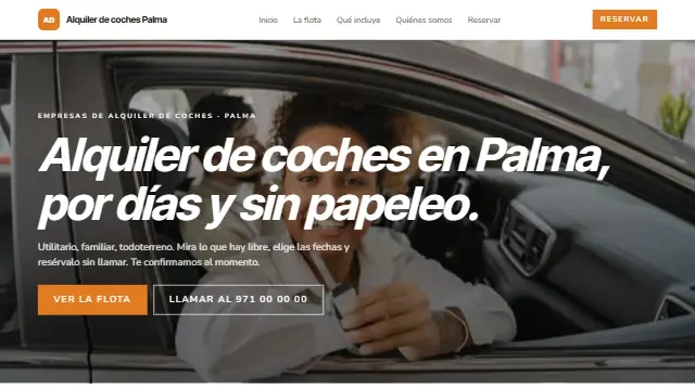
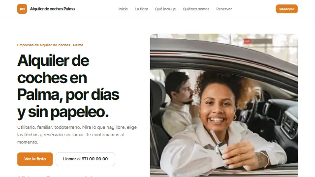
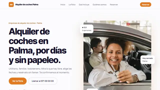
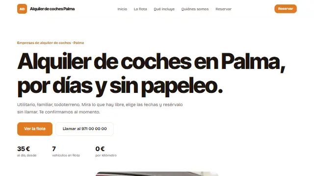
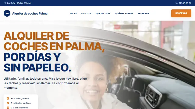
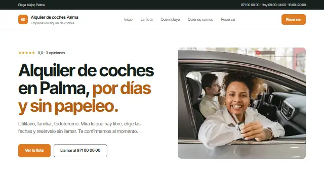
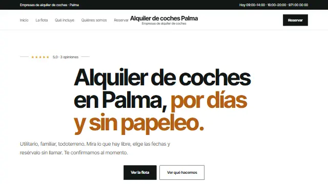
- A full-screen photo with a large serif headline on top and a minimal white header. Elegant and airy. Works well for: When the photo sells on its own: restaurants, accommodation, boat or car hire.
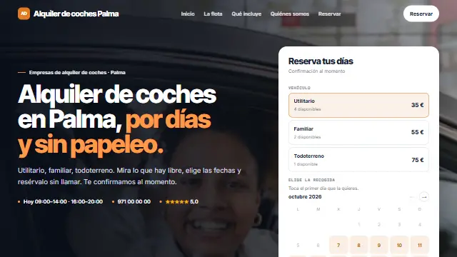
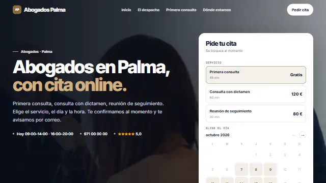
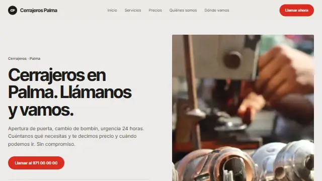
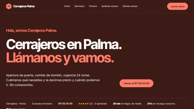
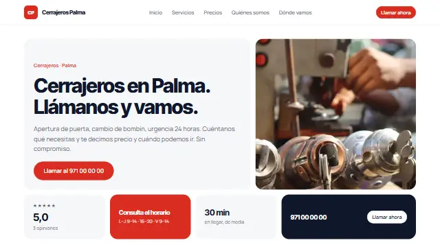
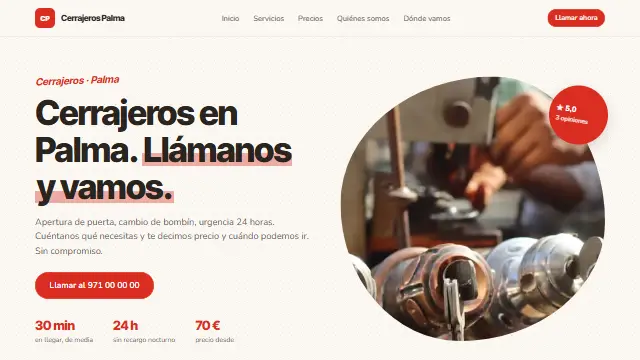
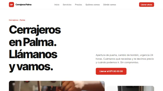
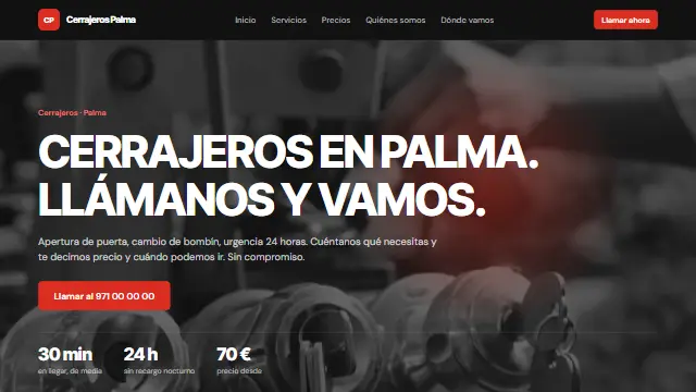
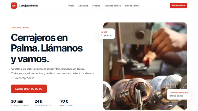
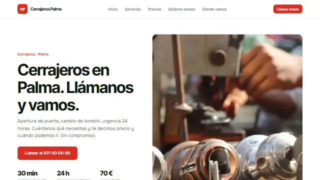
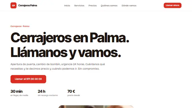
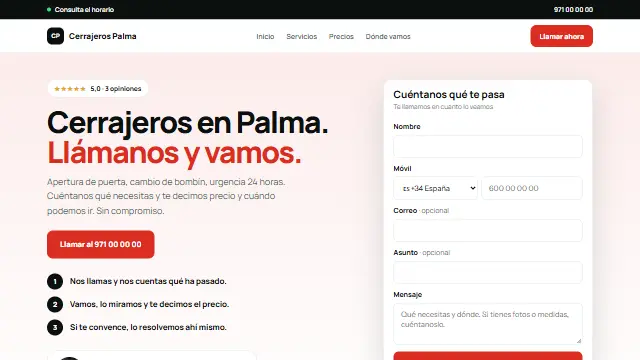
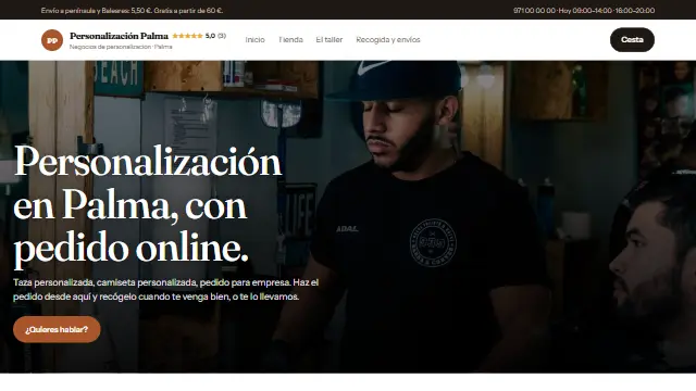
- Contraste
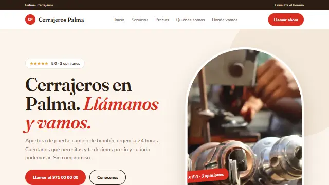
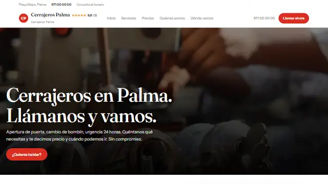
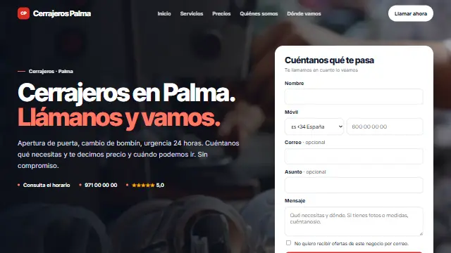
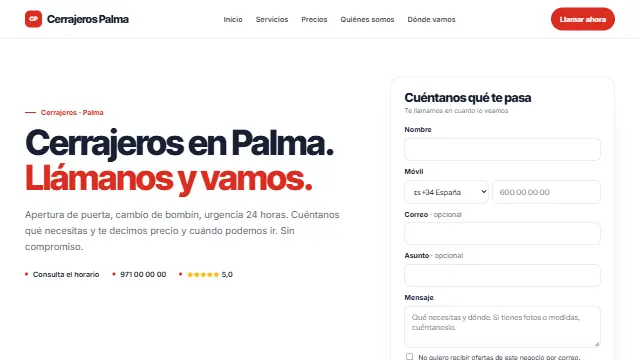
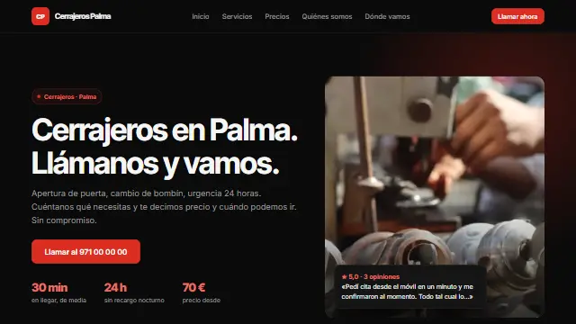
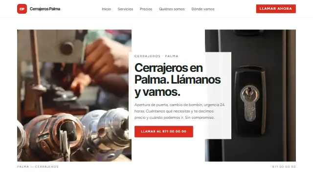
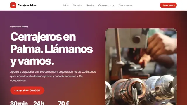
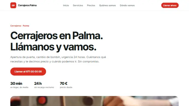
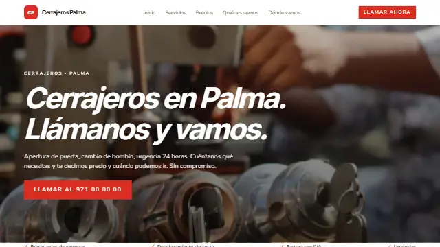
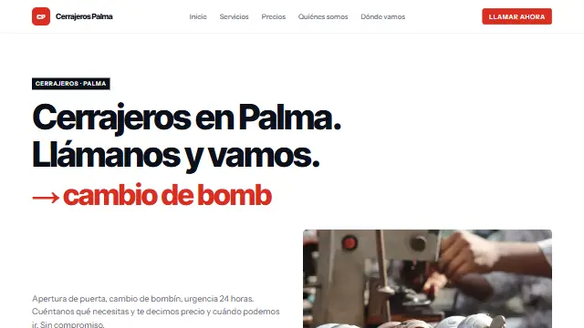
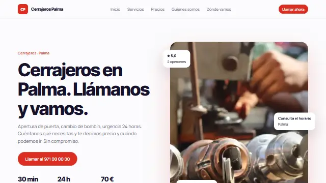
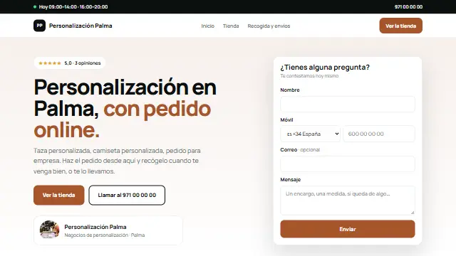
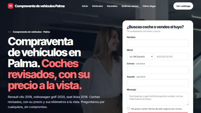
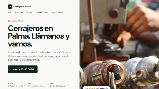
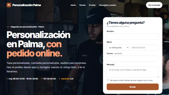
- The homepage over the photo with a dark veil, a large headline on one side and the form in a white card on the other. Services in cards and a dark footer. Works well for: Trades that live from quotes: renovations, plumbers, removals, locksmiths.
- Lienzo
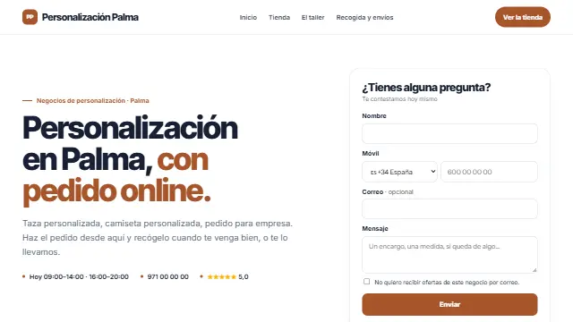
- The same as Contraste, all on white: large headline, the form in its card alongside and sections separated by a thin rule. Works well for: The same as Contraste, brighter: accountants, firms, renovations, cleaning.
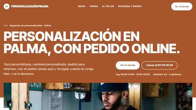
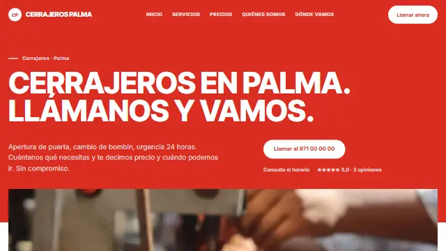
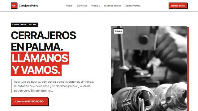
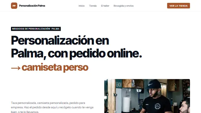
- Obra
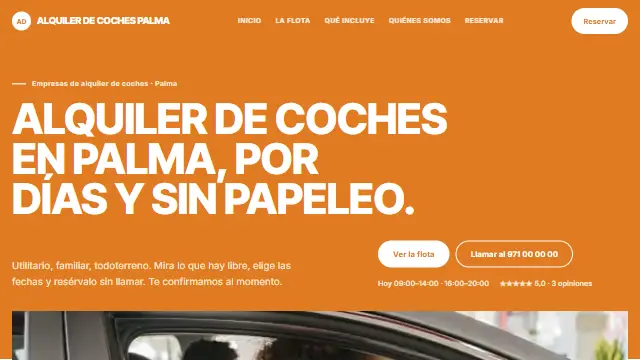
- The business colour at full strength on the homepage, uppercase headlines, services with photos and a call-to-action band halfway down. For renovations, building and removals. Works well for: Trades that show their work: renovations, construction, removals, facade painting.
- Artesano
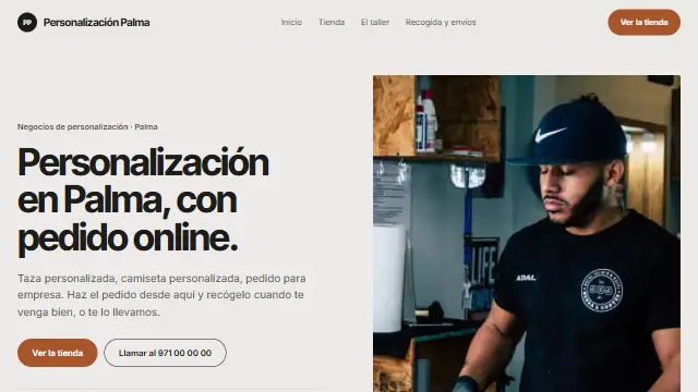
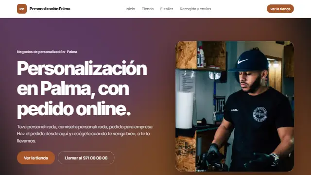
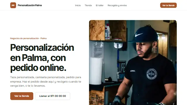
- Warm grey background, the homepage split into text and photo, the first job shown large and the rest below. For painters, carpenters and trades. Works well for: Workshop trades sold on what they have made: painters, carpenters, upholsterers, restorers.
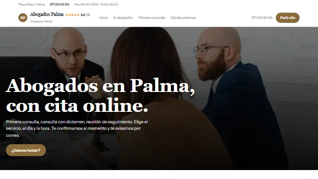
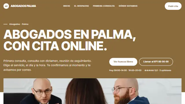
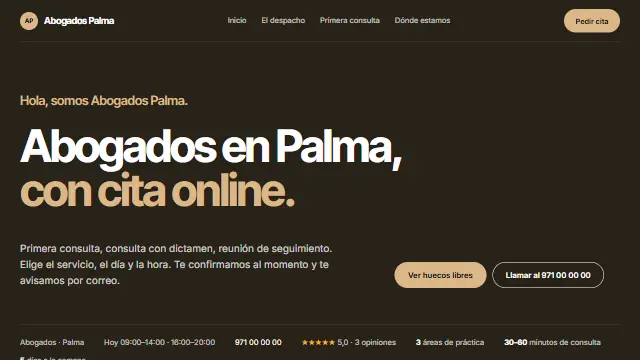
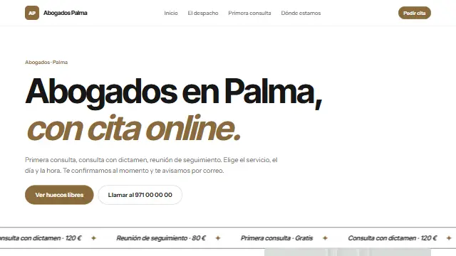
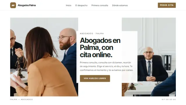
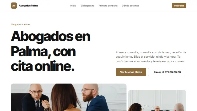
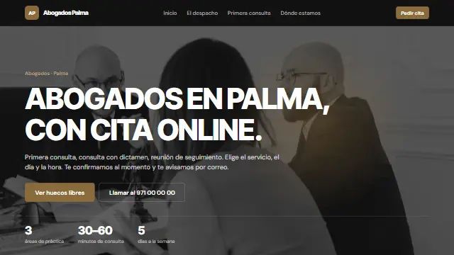
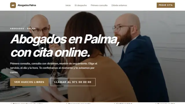
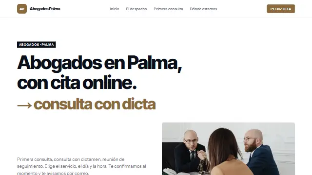
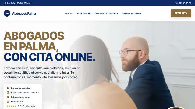
- Despacho
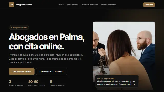
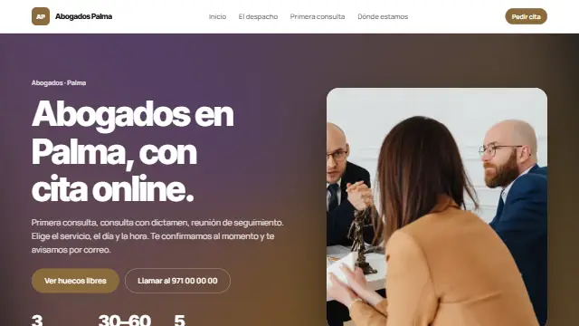
- A text-only homepage, large, on a very dark shade of the business colour; practice areas in a list, the method and the form. For lawyers, accountants and consultants. Works well for: Where people buy trust, not photos: lawyers, accountants, advisers, consultants.
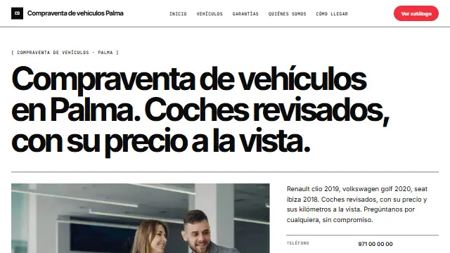
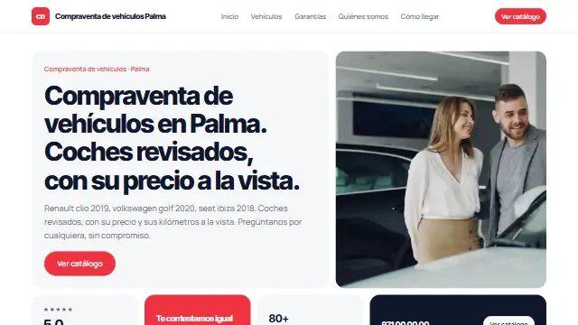
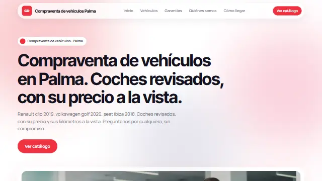
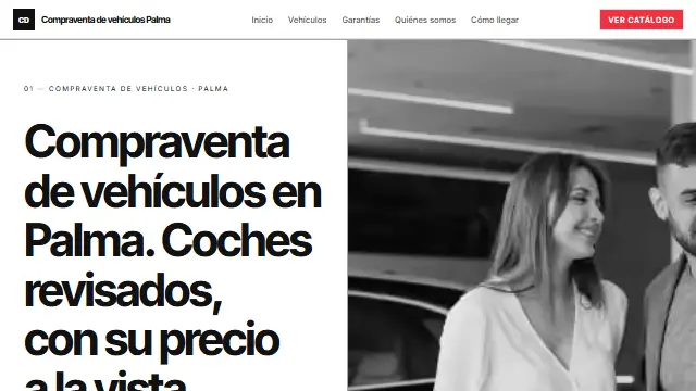
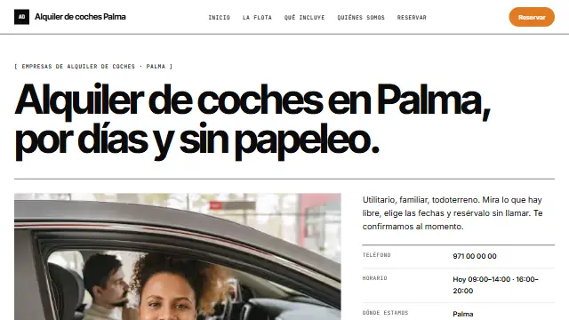
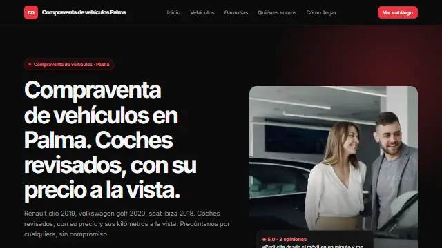
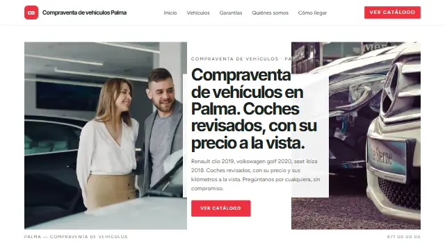
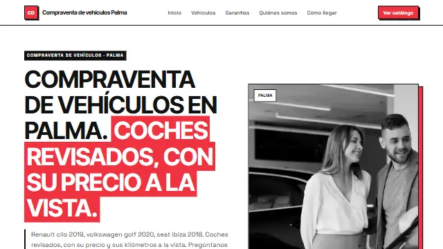
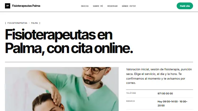
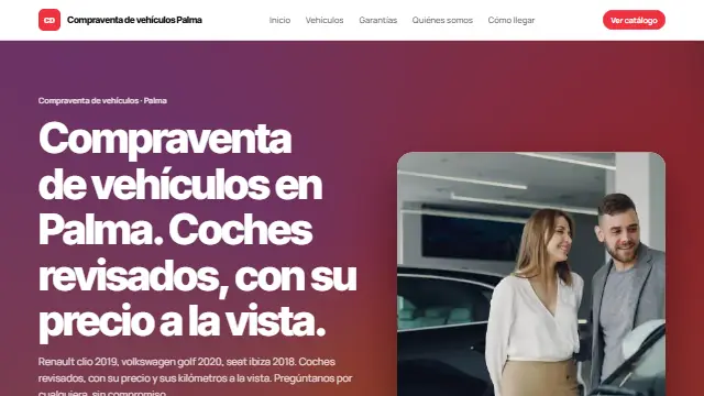
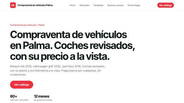
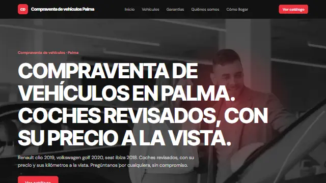
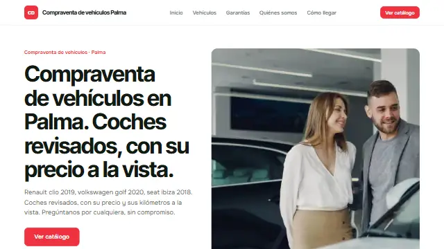
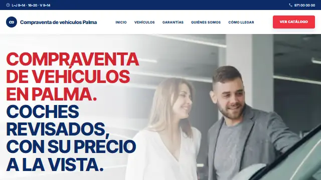
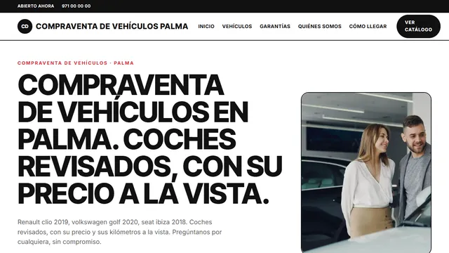
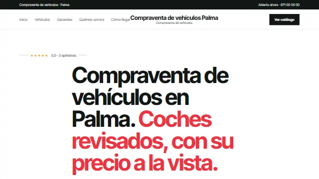
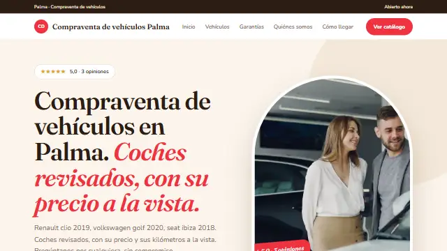
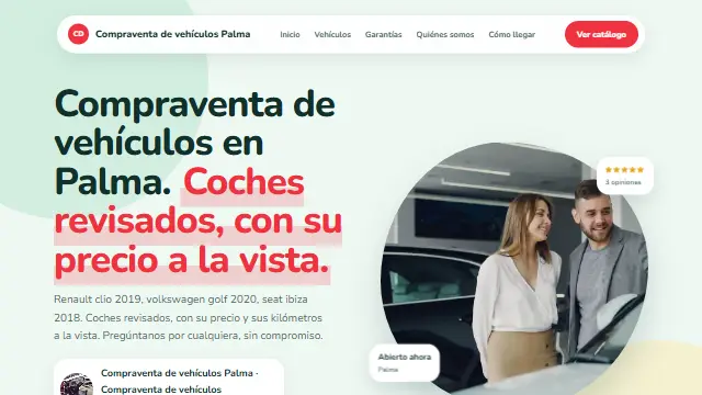
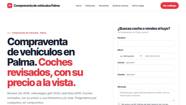
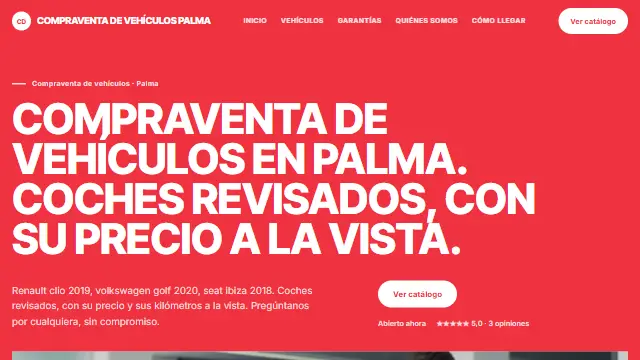
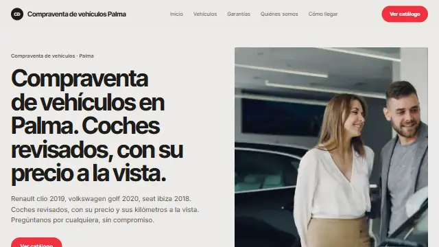
- Editorial
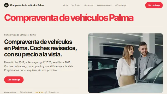
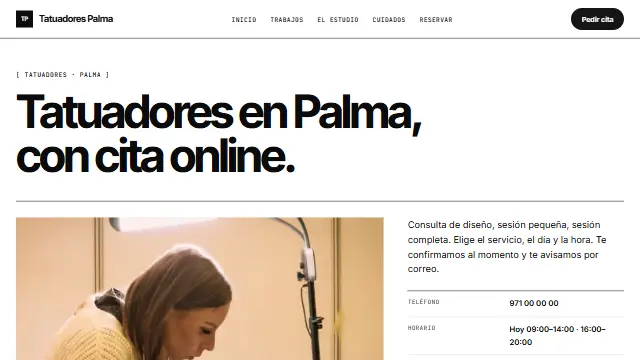
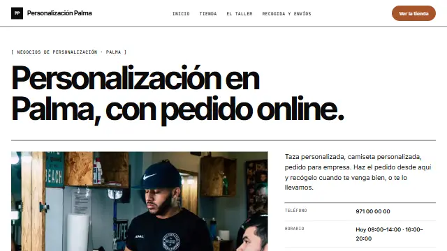
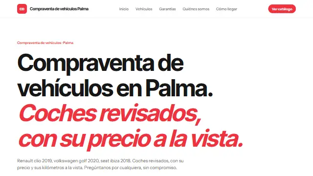
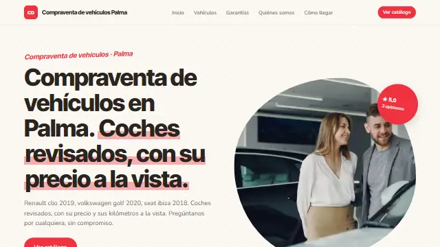
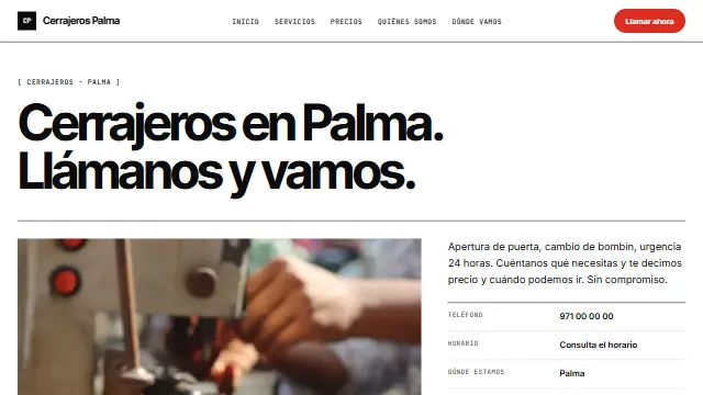
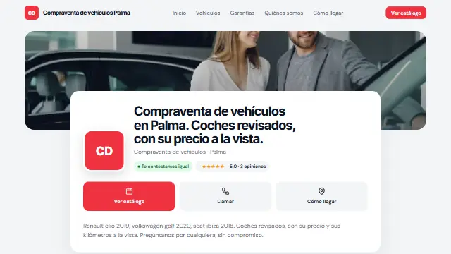
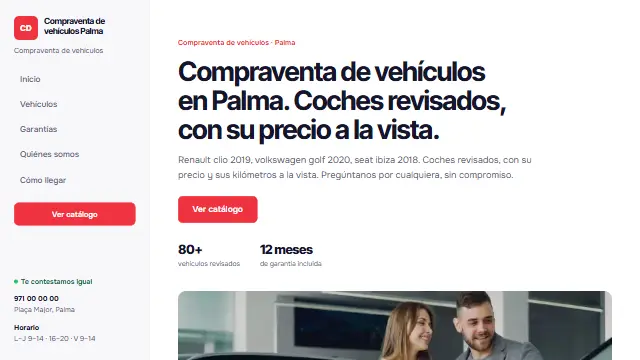
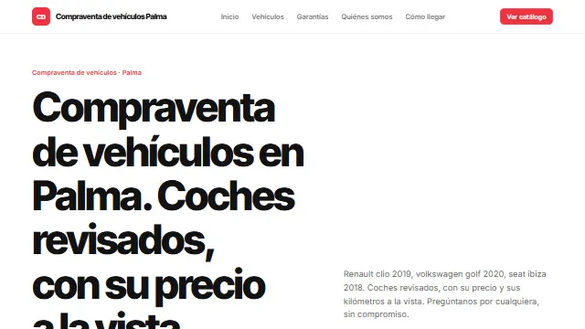
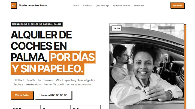
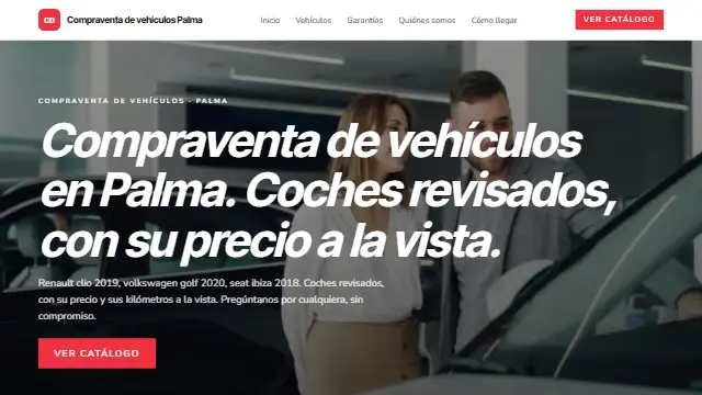
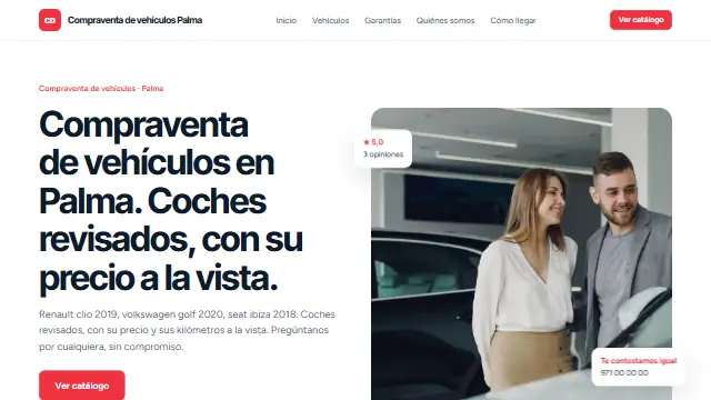
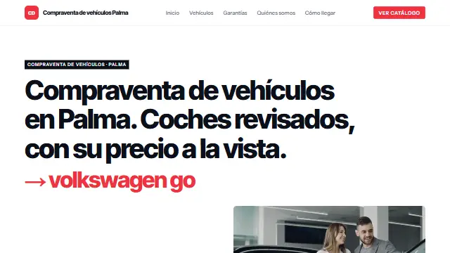
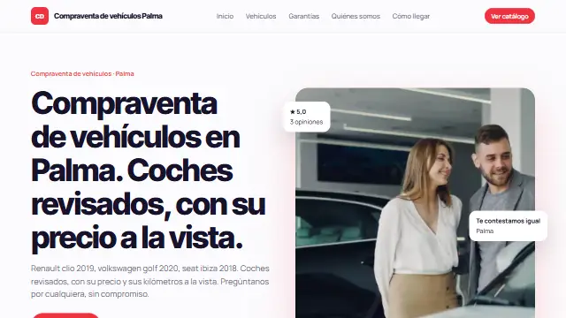
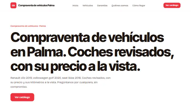
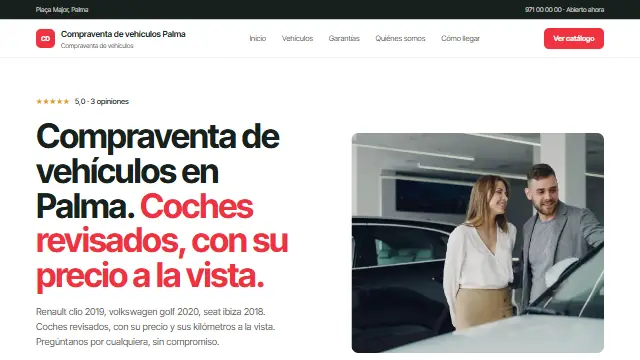
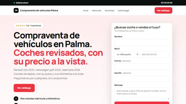
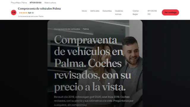
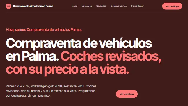
- Black and white, small labels in square brackets and services as data sheets with their details in columns. For catalogues, cars and consultancies. Works well for: Businesses chosen by comparing data: used car dealers, catalogues, consultancies.
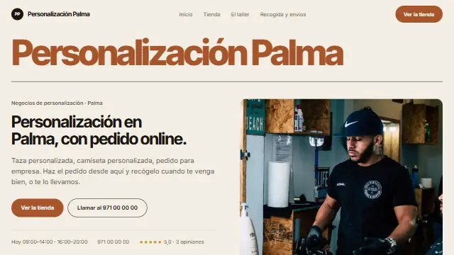
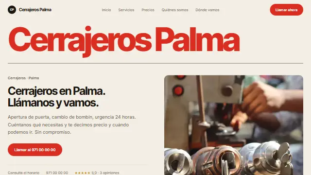
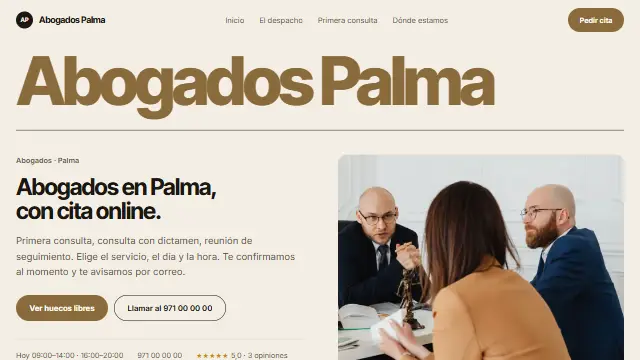
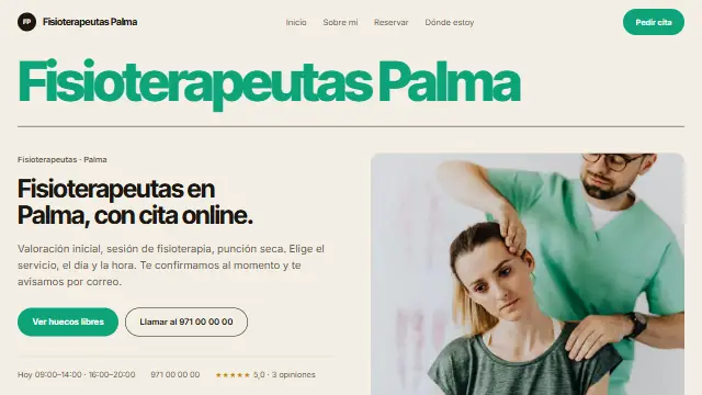
- Rótulo
- The business name large, full width and in its colour, on cream, with what it does underneath. For brands with few photos. Works well for: Brands with few photos and a name to remember: shops, studios, personal brands.
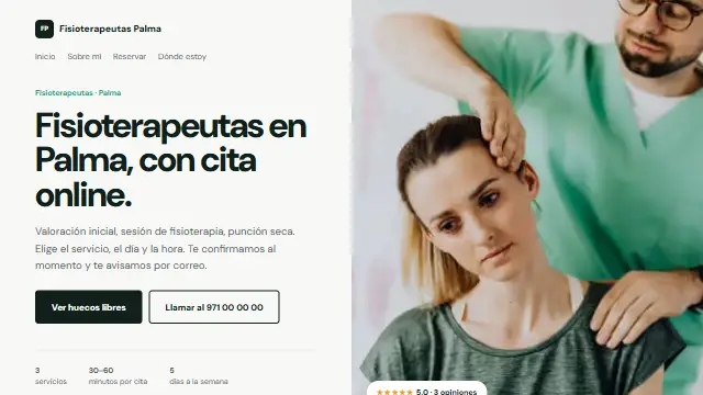
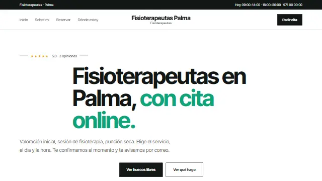
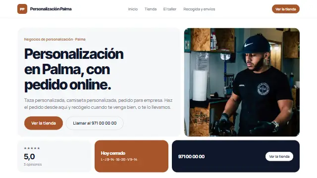
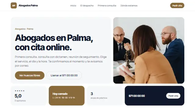
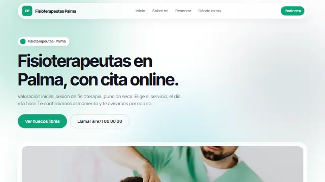
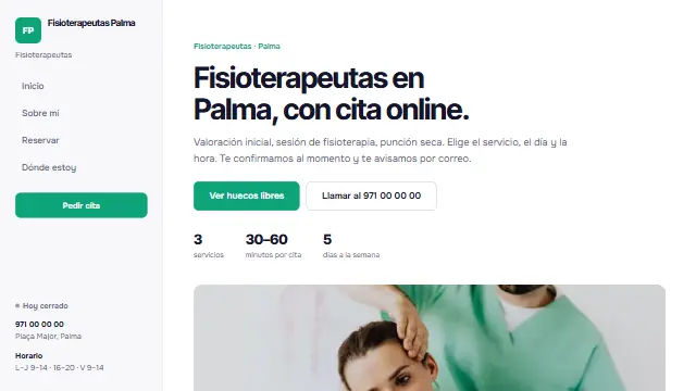
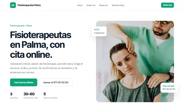
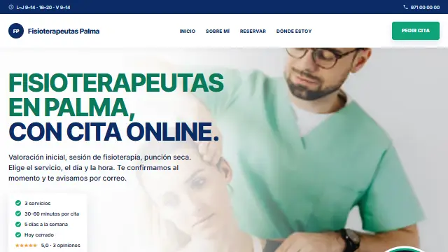
- Bento
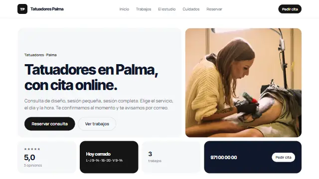
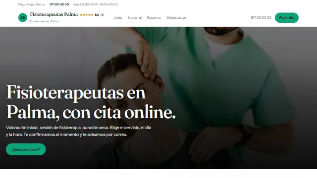
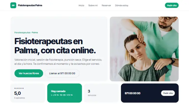
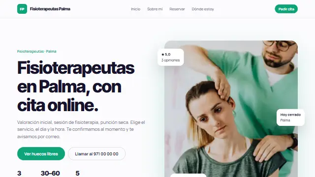
- White background and the homepage as a mosaic of cards: the headline, the photo, your reviews, today’s opening hours and the booking button. Like an app. Works well for: Practices and centres that want to look like an app: physiotherapy, clinics, beauty, academies.
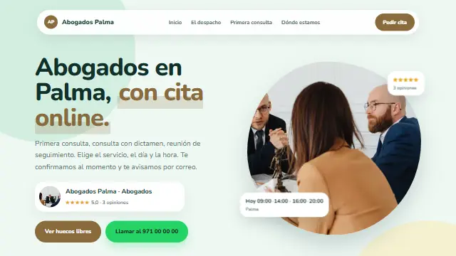
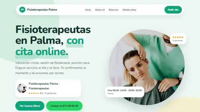
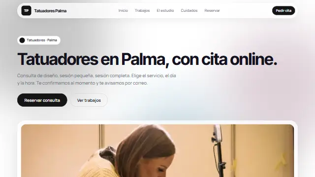
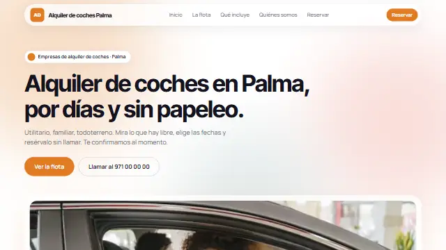
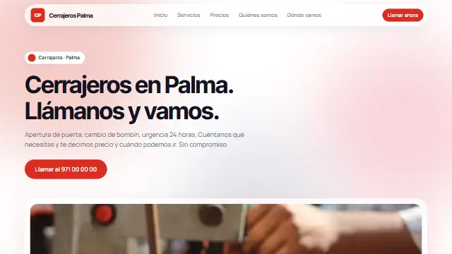
- Aurora
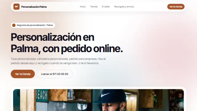
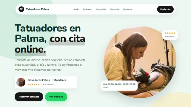
- White with soft glows of your colour behind, a floating pill-shaped header and glass cards. The feel of a new app. Works well for: Young businesses with a gentle touch: psychology, coaching, beauty, wellbeing centres.
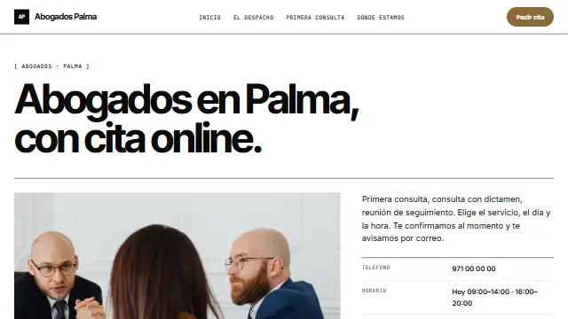
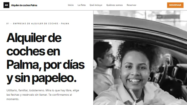
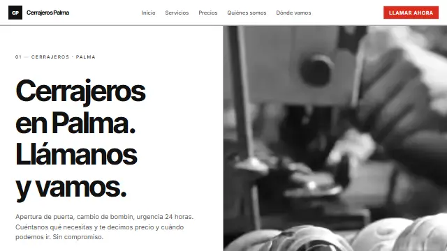
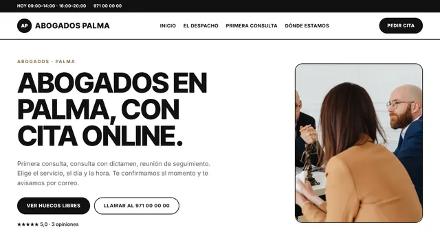
- Suizo
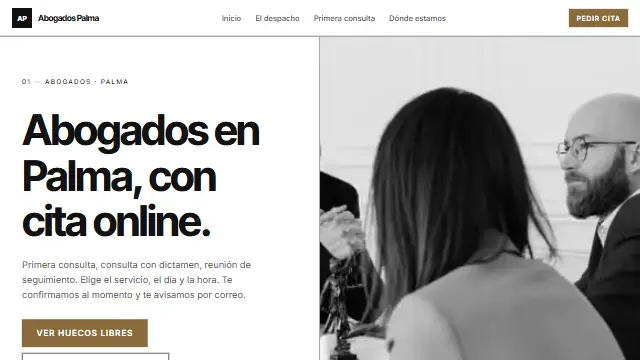
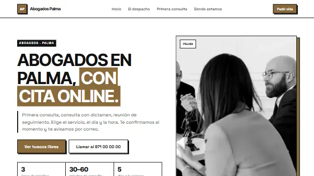
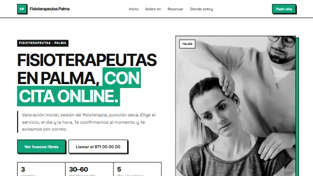
- A strict grid with black lines, huge headlines, a single accent colour and the photo in black and white. Sober and authoritative. Works well for: Where seriousness rules: lawyers, architects, accountants, design studios.
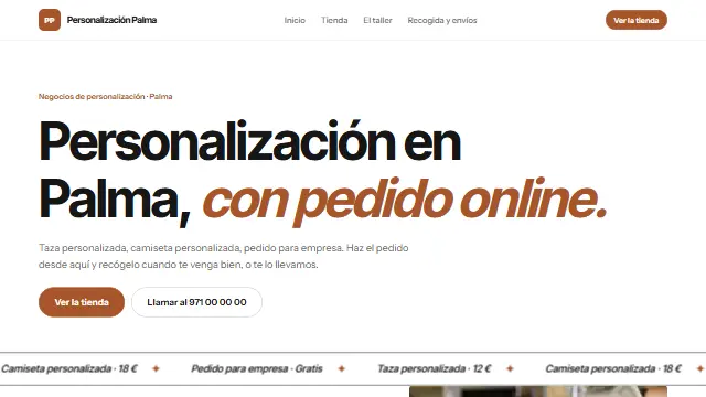
- Marquesina
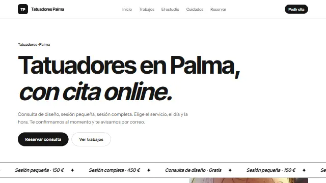
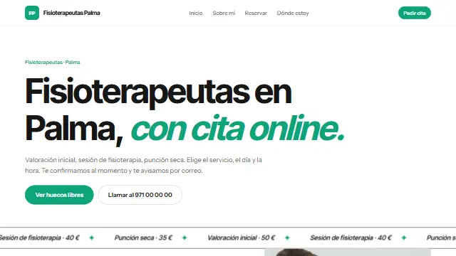
- A large headline ending in your colour, a ticker running with your services and prices, and three photos with the middle one arched. Works well for: Businesses with character and good photos: barbers, hair salons, florists, studios.
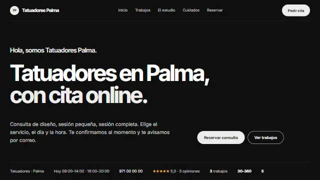
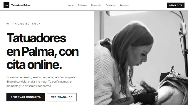
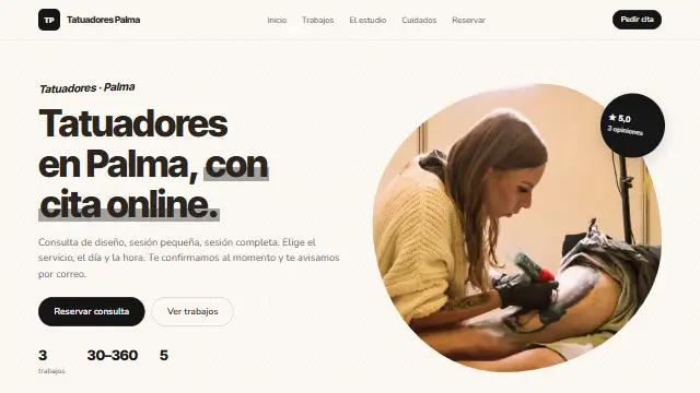
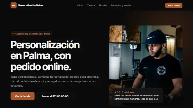
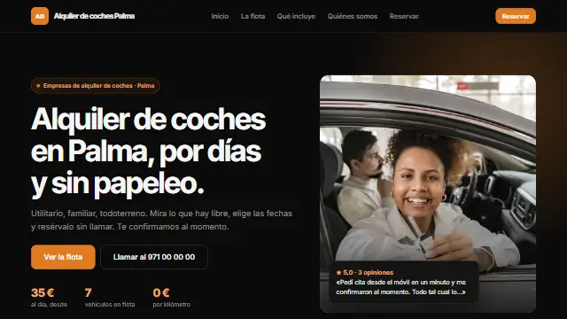
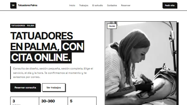
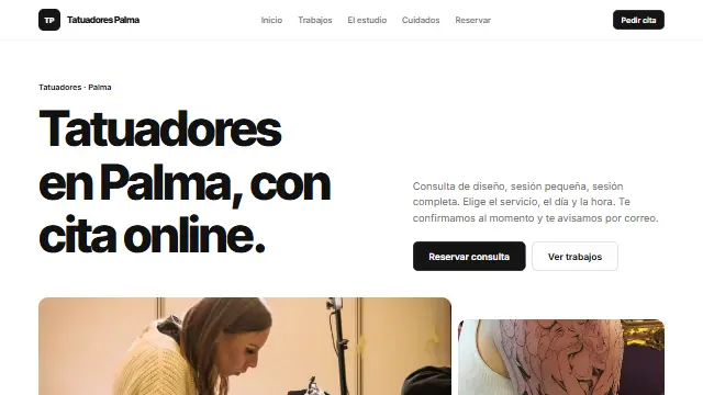
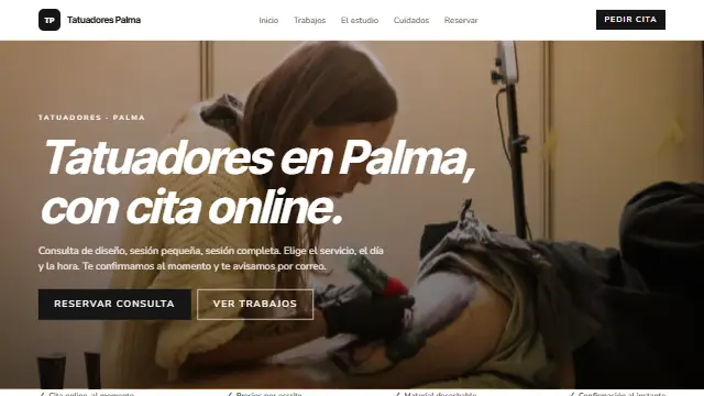
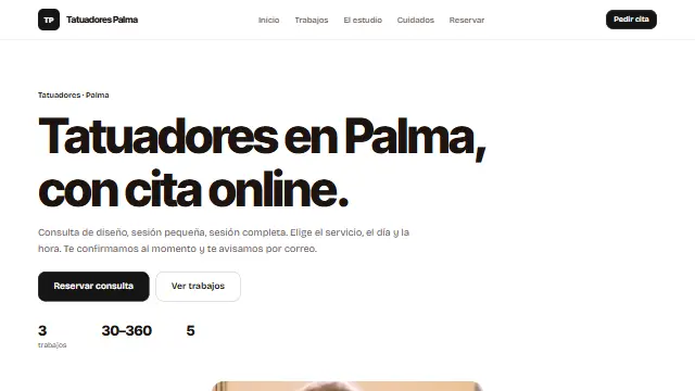
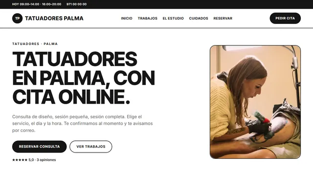
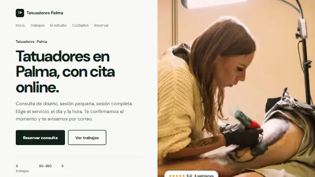
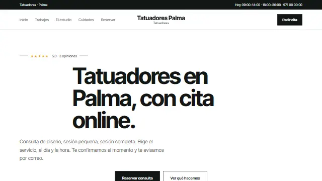
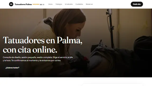
- Nocturna
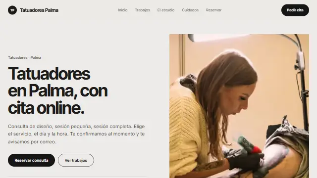
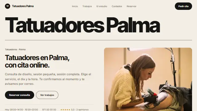
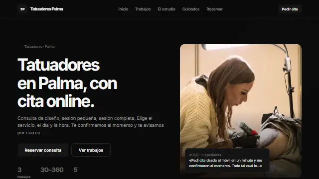
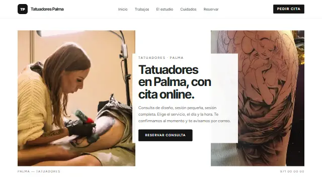
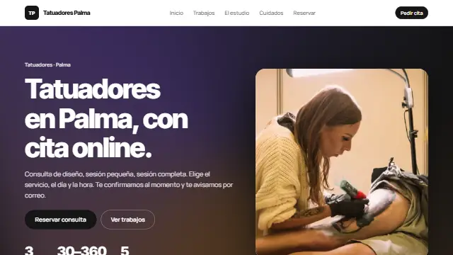
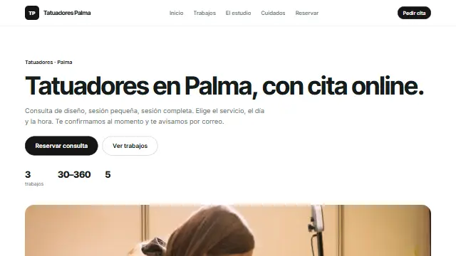
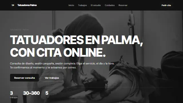
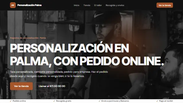
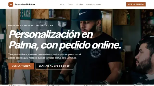
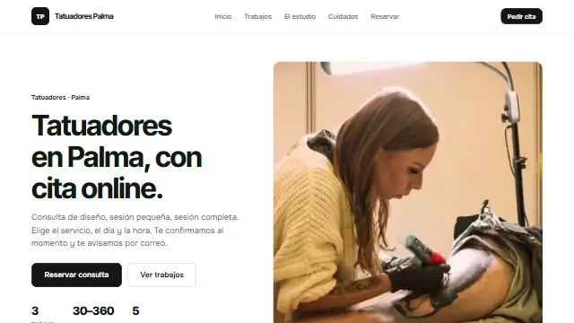
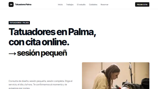
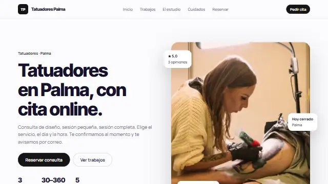
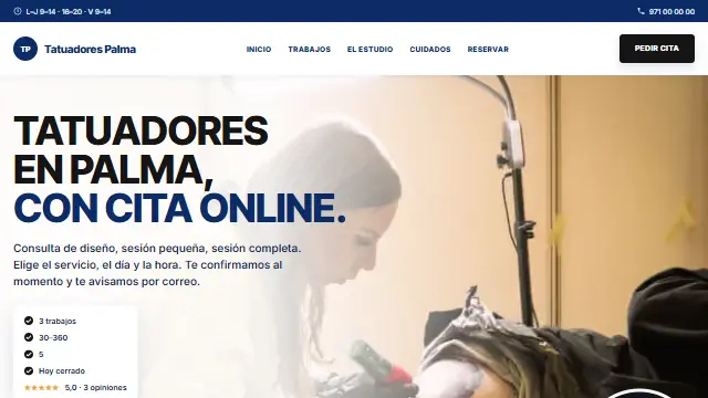
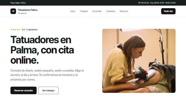
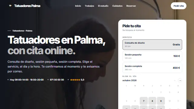
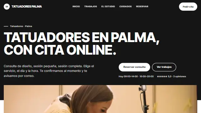
- A real dark mode: black, your colour glowing, cards with a fine border and the photo under a veil. For gyms, tattoo artists and barbers. Works well for: What lives at night or on strength: gyms, trainers, tattoo artists, barbers, music.
- Papel
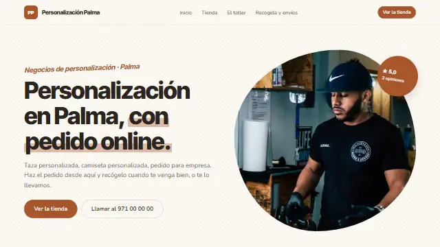
- Warm minimalism: dotted paper, the photo cut into an organic shape, a hand-underlined headline and a sticker. For nutrition, therapies and yoga. Works well for: Warm, close practices: nutrition, therapies, children, yoga, speech therapy.
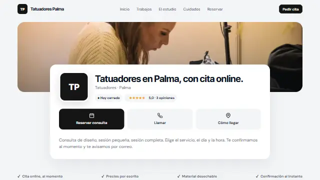
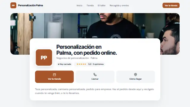
- Tarjeta
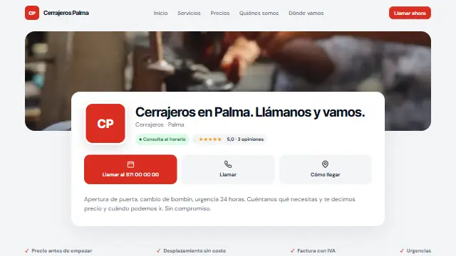
- Like a profile card: cover photo, your logo, today’s opening hours, your reviews and four quick buttons. Designed mobile first. Works well for: Businesses people look up on their phone: dental clinics, workshops, hair salons, emergencies.
- Mosaico
- A photo collage with the headline laid over it, wide-spaced uppercase buttons and services in a two-column list. A wellbeing magazine. Works well for: Image and wellbeing businesses: yoga, pilates, spas, photography, interior design.
- Neo
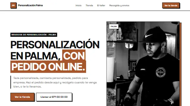
- Thick black borders, hard shadows, your colour flat and uppercase. It grabs attention and looks like no other. Works well for: Brands that want to stand out: tattoos, shops, agencies, dance academies, events.
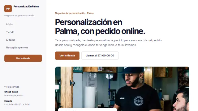
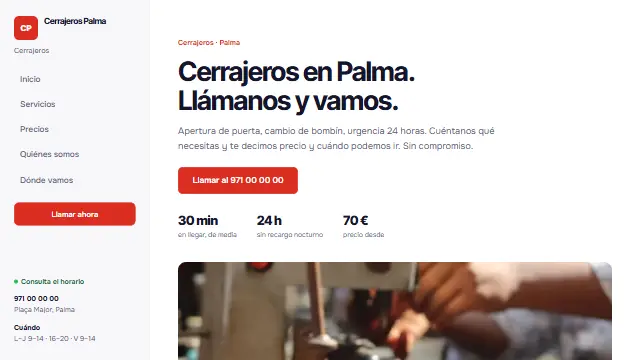
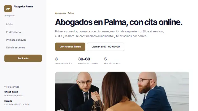
- Lateral
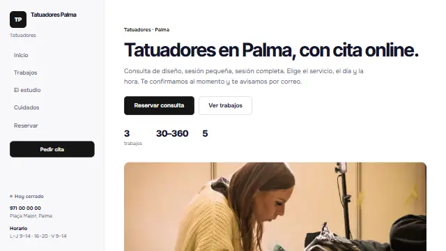
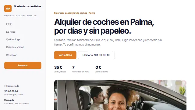
- A fixed side menu with your logo, the menu, opening hours and phone always visible; the content scrolls alongside. Like a dashboard. Works well for: Websites with a lot to say: academies, clinics with several areas, firms, driving schools.
- Impulso
- A dark homepage with a gradient of your colour slowly turning, numbers that count up as you arrive and sections that appear as you scroll. Full of energy. Works well for: Businesses with energy: personal trainers, gyms, crossfit, sports, events.
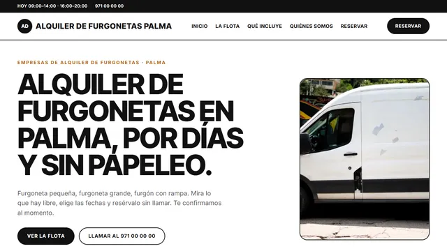
- Deslizante
- A huge headline, staggered photos and services in a carousel you swipe or move with arrows, in light cards and cards in your colour. Works well for: Those with many services to show: barbers, beauty, workshops, rentals.
- Capas
- Services are large cards that stack on top of each other as you scroll, in shades of your colour; the rest is calm. For practices and therapies. Works well for: Practices and therapies with services to explain: psychology, physiotherapy, medicine, coaching.
- Foco
- A black homepage with a black-and-white photo and a spotlight in your colour that follows the mouse; the rest is clean white. Cards darken on hover. Works well for: Studios with style: tattoos, photography, barbers, recording studios.
- Cinta
- A full-screen photo moving slowly, like in the cinema, and reviews passing by one at a time. For spas, yoga and beauty. Works well for: Businesses of calm and experience: spas, yoga, beauty, accommodation, weddings.
- Pestañas
- Each service in its own tab, with a sliding indicator, and cards floating over the cover photo. Tidy and lively. Works well for: Clinics and centres with several treatments: dentists, physiotherapy, beauty, vets.
- Antes y después
- A before-and-after slider you drag on the homepage and a ticker with what you do. For beauty, renovations, cleaning and tattoos. Works well for: Work that shows in a photo: beauty, renovations, cleaning, painting, tattoos, nutrition.
- Tipo
- Huge type and your services typing themselves out one after another in your colour. Buttons that jump on hover. For law firms, accountants and agencies. Works well for: Firms and trades of the spoken word: lawyers, accountants, agencies, consultants, academies.
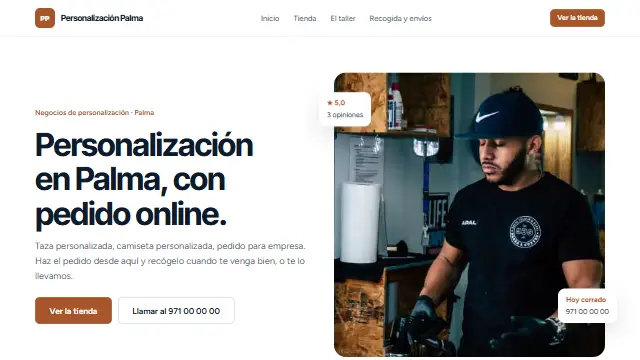
- Flotante
- The photo tilts in 3D as you move the mouse, with floating badges showing your reviews, opening hours and a service. Cards that lift. Works well for: Businesses that want to feel modern: physiotherapy, clinics, beauty, trainers.
- Escena
- The cover photo starts narrow and opens to full width as you scroll, with a band of your colour running underneath. Bold. Works well for: Businesses that tell their story with photos and figures: academies, gyms, renovations, schools.
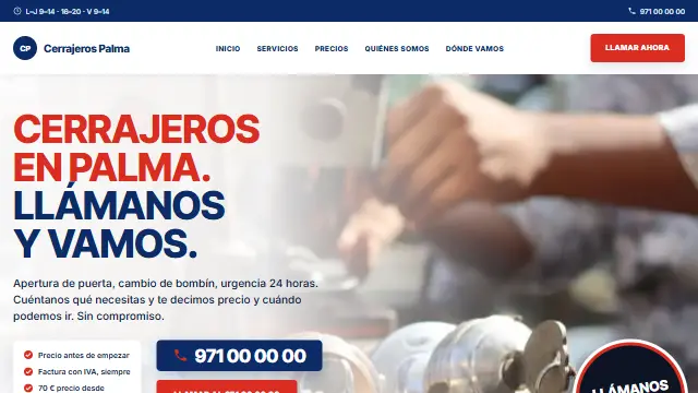
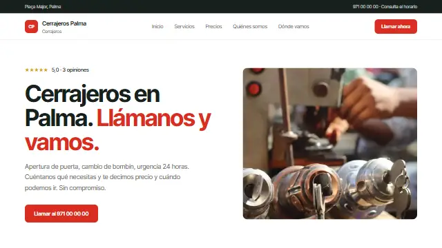
- Instalador
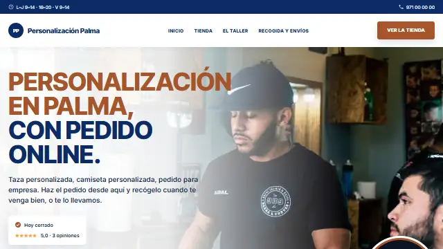
- A blue bar with opening hours and phone, the homepage over your photo with a two-colour headline and a large phone number, services with icons and a blue trust band. For air conditioning, plumbing and electricians.
- Mayúscula
- Black and white, huge uppercase headlines and round buttons; a ticker with what you do, thick-bordered cards that turn black on hover and contact in a black block. Bold and modern.
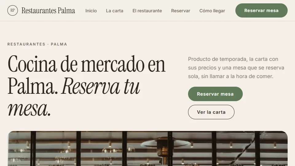
- Sal y Limón restaurant
- A full-screen photo of the dining room, fine serif and olive green. Below, opening hours, address and booking phone; the menu in columns. Works well for: Market cuisine, bistros and eateries.
- Casa Lola restaurant
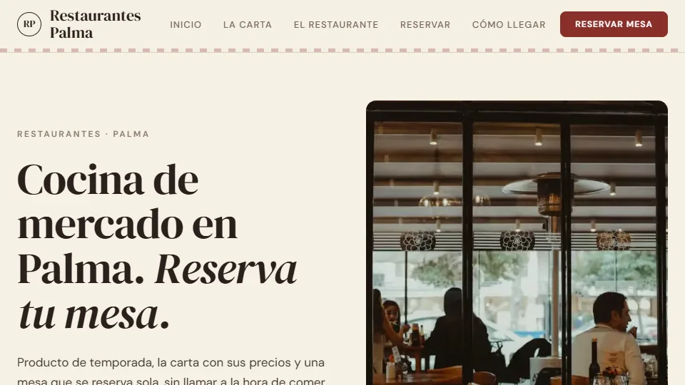
- The homepage split in two, burgundy on cream, with a strip of colour under the header. Homely, like a traditional eatery. Works well for: Taverns, tapas and home cooking.
- Asador Hierro restaurant
- Condensed uppercase type, no frills, in ember tones. A dense menu with every price in view. Works well for: Steakhouses, grills and barbecue.
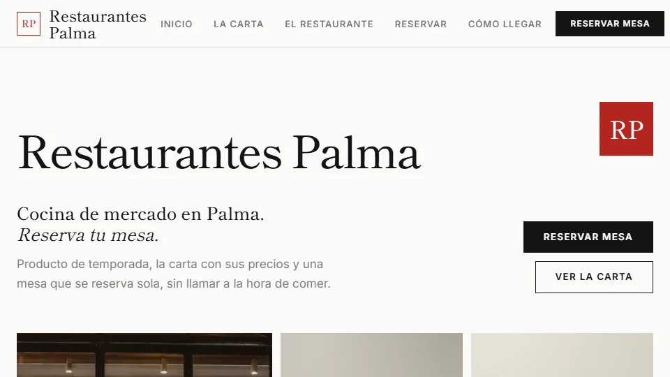
- Kōzen restaurant
- The name huge on the homepage, lots of white and a red seal with the initials. A minimal menu, nothing to distract from the dish. Works well for: Japanese and signature cuisine.
- Mañana restaurant
- A large serif headline, round buttons and sage green on cream. The wide photo below and the menu in cards. Works well for: Cafés, brunch and bakeries.
- Origen restaurant
- Fine serif, gold and a frame over the photo of the dining room. The menu like a tasting menu: course by course. Works well for: Fine dining and tasting menus.